Typography
These were a series of individual assignments during Typography classes.
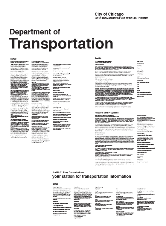
1. Message analysis and 2-dimensional composition
The goal of the project was to explore two-dimensional graphic structure on a poster-scaled single page to organize and convey a complex message in a simultaneous space. I chose the Department of Transportation of Chicago's website. I analyzed the content and organized it into a hierarchical message, then designed the poster.
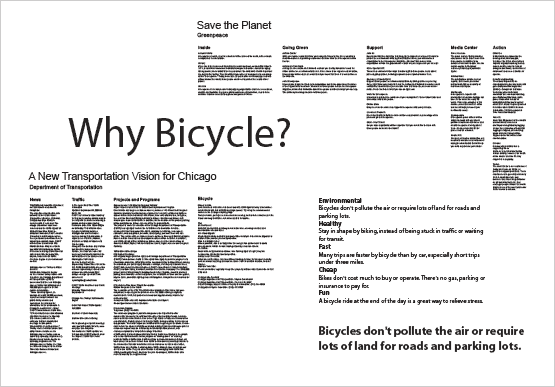
2. Combination of two message texts into one composition
The goal of the project was to explore how graphic composition could display content relationships between message components. I chose the Greenpeace organization's website in addition to the Department of Transportation of Chicago and identified "bicycle" as a 'linking keyword' between the two content groups.
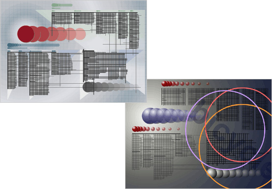
3. Graphic notation of eye movement
The goal of the project was to develop a graphic notational vocabulary of abstract forms - lines, shapes, colors, tones and textures. User observation was conducted to develop awareness of how reader's eyes move across and through textual material on a page.
4. Typography for electronic display
The goal of the project was to bring the graphic compositional notation to life using motion and sound, which conveys both the composition's visual character and the typical eye movement paths included in the graphic notation.
5. Transformation
The goal of the project was to explore the expressive semantic potential of digital typography. I chose two key words - Chicago and Bicycle to transform one text into the other using typographic form, motion, and sound.